Now that i have a rough idea of the interface layout, I need to create icons that represent each of the spending types.
Here are some that I found inspiration from:
1. Shutterstock

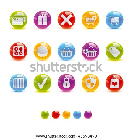
I like the use of colours with these, I think I will definitely need to use a range of colours in order to differentiate between the icons when they are floating on the interface.

The graphics on these icons give me a good idea of how I might represent each category. For example, I really like the heartbeat one which could represent health etc.
I want to keep the icons quite simple - drawing on design analogies such as a scholars cap to represent education. However, when the user hovers over them text will appear to let the user know exactly what spending type that icon is. This eliminates any confusion over what the graphic/icon stands for.
No comments:
Post a Comment